

Exploratory Data Analysis
After collecting our data, the first thing we want to do is to get an understanding of it. Exploratory Data Analysis or short EDA is one of the essential steps in the data analysis process. By trying to make sense of the data, we can start formulating questions and if necessary go back and make changes to where our data came from, and others.
Remember, the number of source URLs is not very well balanced if we are looking at the categories. We started with 134 URLs categorised as fake and from our source dataset with only 3 reliable URLs, which we increased to over 70 URLs with our own.
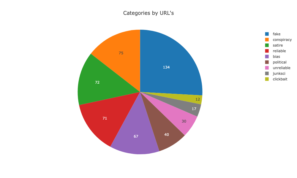
However, I went ahead and collected as much data as possible and as it turns out correctly so. As we can see in the image below the distribution turned up-side-down. I wasn’t expecting that at all.
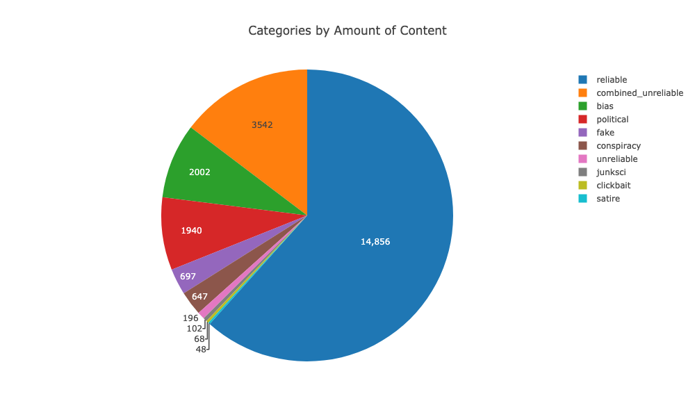
So we don’t need the extra content we got from the archived data at webhose.io.
Sentiment
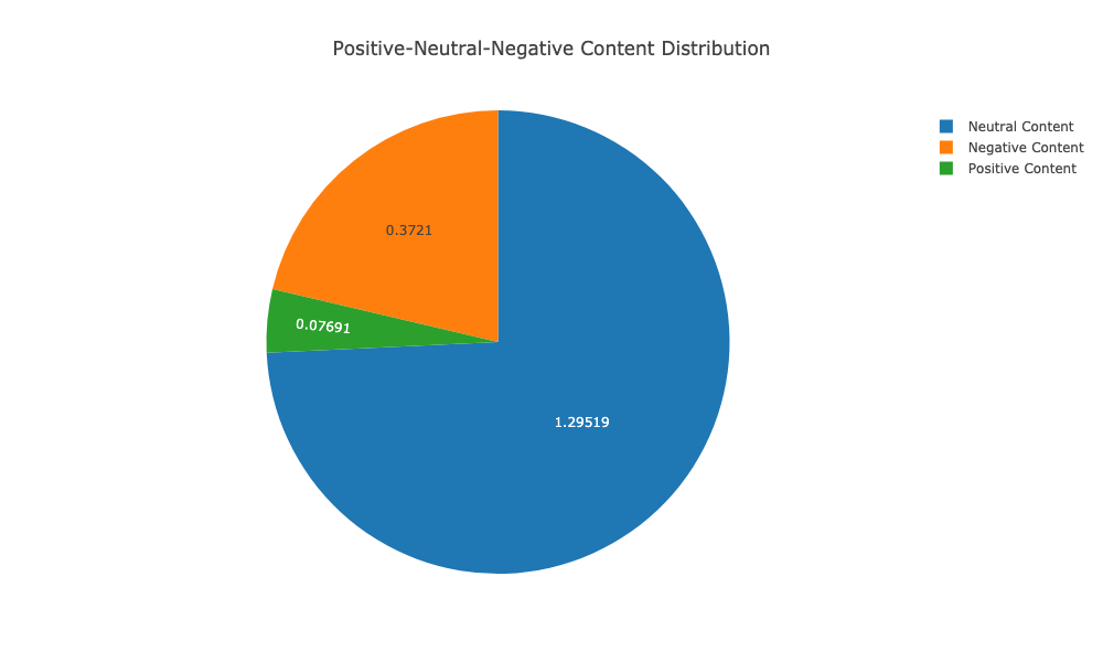
In natural language analysis, one of the first steps one wants to do is understand the sentiment of a given text. Our data is to 75% neutral, which I guess is a good thing. The interesting part here is the thing that for the rest of our data the negative content overweights the positive content drastically.
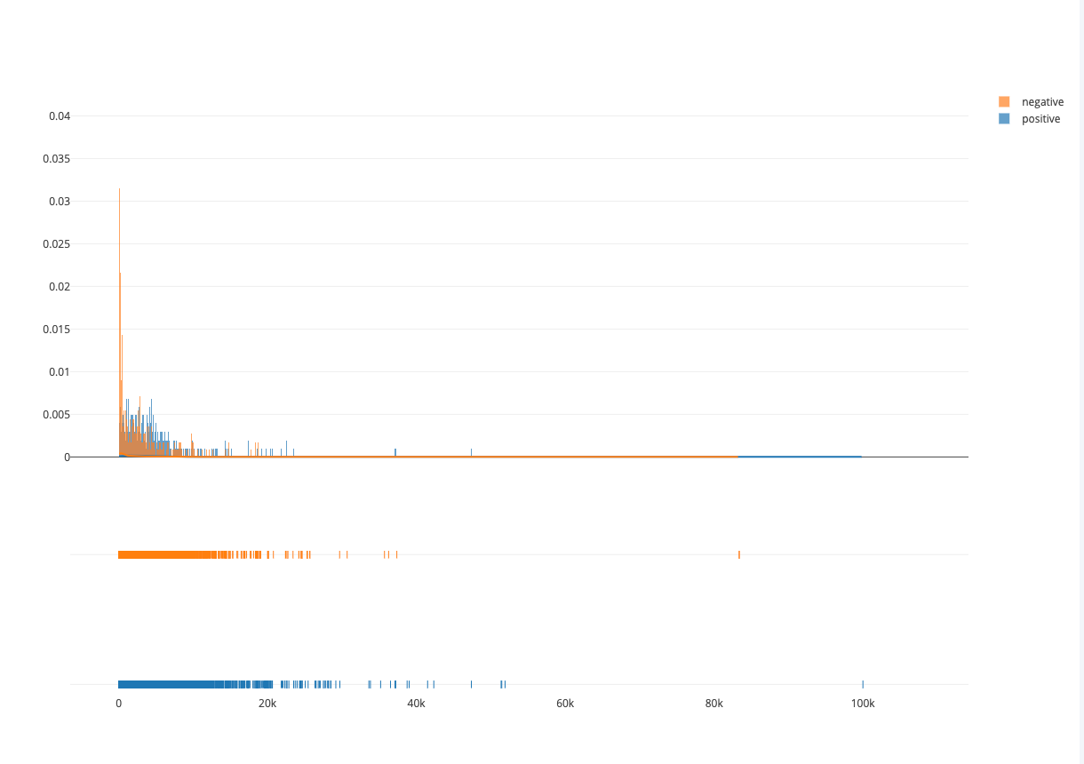
Moreover, we can see that also in the distribution about the number of words in an article and its sentiment weighting. The shorter an article is, the more likely it is that it is negative content.
Visualizing differences based only on term frequencies
Occasionally, only term frequency statistics are available. In the case where this may happen like in very large, lost, or proprietary data sets. To help us here we can use the tool scattertext which is based on spaCy. TermCategoryFrequencies function is a corpus representation, that can accept this sort of data, along with any categorised documents that happen to be available.
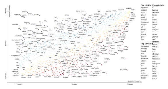
Visualizing TermCategoryFrequencies (link opens in new tab)
The critical part to note here is that the data represented in this plot comes from unbalanced data.
Topic Modeling
Another question we can try to find an answer to is what are the most written about topics in our news content. We can use Gensim/LDA here to find them but there is a more intuitive and interactive way to help visualise topic model using sklearn and the python library pyLDAvis which is a port of the fabulous R package by Carson Sievert and Kenny Shirley.
news_content = df[df.category=='reliable'].news_content.tolist()

tf_vectorizer = CountVectorizer(strip_accents = 'unicode',
                                stop_words = 'english',
                                lowercase = True,
                                token_pattern = r'\b[a-zA-Z]{3,}\b',
                                max_df = 0.5,
                                min_df = 10)

tfidf_vectorizer = TfidfVectorizer(**tf_vectorizer.get_params())
dtm_tfidf = tfidf_vectorizer.fit_transform(news_content)
lda_tfidf = LatentDirichletAllocation(n_topics=20, random_state=0)
lda_tfidf.fit(dtm_tfidf)

vis_data = pyLDAvis.sklearn.prepare(lda_tfidf, dtm_tfidf, tf_vectorizer)
pyLDAvis.display(vis_data)
pyLDAvis is designed to help users interpret the topics in a topic model that has been fit to a corpus of text data. The package extracts information from a fitted LDA topic model to inform an interactive web-based visualisation.
The pyLDAvis interface:
- the left panel shows how common and how each topic relates to each other in 2D space.
- the right panel shows us a list of the most notable word (topics) and its frequency. If we select a topic, we see the topic-specific frequency of each term (red) and the corpus-wide frequency (blue).
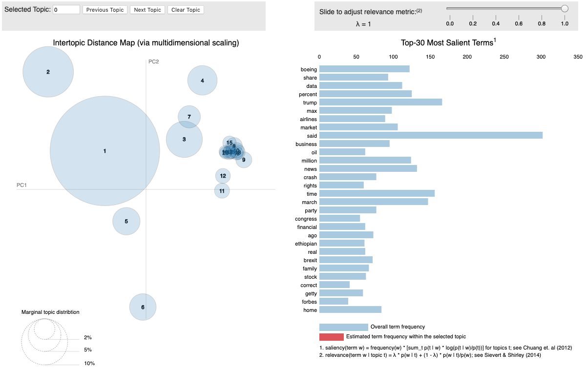
Visualizing LDA (link opens in new tab)
Linguistic Features
spaCy offers excellent tools to process raw text. Most words are rare, and it’s common for words that look entirely different to mean almost the same thing. The same words in a different order can mean something completely different. Even splitting text into useful word-like units can be difficult in many languages. While it’s possible to solve some problems starting from only the raw characters, it’s usually better to use linguistic knowledge to add useful information. That’s exactly what spaCy is designed to do: you put in raw text and get back a Doc object, that comes with a variety of annotations.
To continue working on our Exploratory Data Analysis and help us understand our content we shall use spaCy’s statistical entity recognition system as well as spacy-vis, a visualisation tool using Hierplane.
Jupyter Notebook
Here is the notebook to that post.